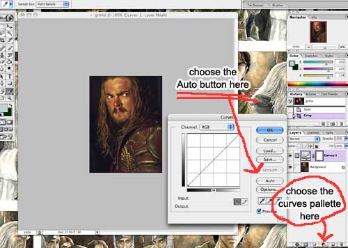
How to make Eomer look like a pencil sketch -

I'm afraid this tutorial will be both too elementary in some places, since I know some of you are new to this -- and too vauge in others.

Please ask questions if I loose you, and I will try to get Jim to give me better vocabulary. I have never done this before, so we can teach each other as we go.


Step 1: chose the photo you want to work from.

I am having good luck with portraits/face shots that have good detail
(but not too many fiddly bits until you get the hang of it.)

Dont forget to unlock the layer - I hate this feature of photoshop 7!

If you think you will want to be able to use the background for effects later, make a duplicate layer of your picture now and turn it off.

You also might want to think about removing your subject from his background now....


Step 2:crop the picture to the dimensions you want.

I like to put the subject off center, and if you have background to remove, this may also let you avoid some of that.


Step 3: Curves

If your picture is shifted heavily into strange lighting, (think blue Boromir in Lorien) select the curves option from your layers palette and shift it. For this project, you can probably get away with using the "Auto" button instead of fishing for the midpoint grey.


Step 4: Levels
Now go back to the layers pallette and choose levels.

Slide the "Brightness" slider to the left until the picture is very bright, (but not until the detail is blown out.)

If the picture was quite dark or saturated to begin with, you may need to bump up the gamma as well, especially if you are working on a Mac - remember, everything is darker on the PC. I start by making the Gamma 1.2 instead of 1.0, and add one point at a time until it starts to look washed out - then I back down to the last number. (You have to picture in your head how much darker the picture is on the pc. If you haven't had to do that before, try using the "Save For Web" command with the second window set for windows, and let it show you the two saturations side by side.)


Step 5: Sharpen
choose the original layer your picture is on
go up to the menu bar under "filter" and get Unsharp Mask

You want to push the sharpness up as much as you can without getting jpg artifacts. Very sharp - very harsh.

(I'm afraid this is going to be different for every picture, but I am having good luck by starting with the ammount at 100, the radius at 1 and the threshold at 0)

Now, Merge All Your Visible Layers


Step 6: Go to the menu bar, under filters
go all the way to the bottom and get "Custom"
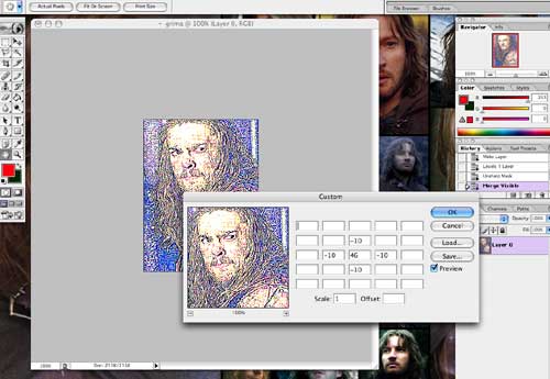
start by 
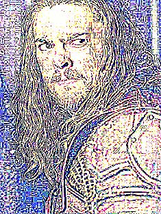
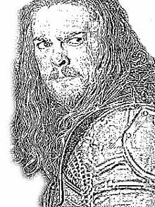
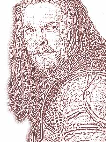
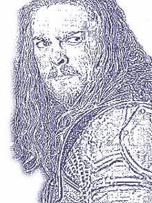
filling in the number 40 in the center square, and enter the number -10 above, below, and to each side. This will give you an image 
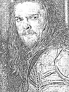
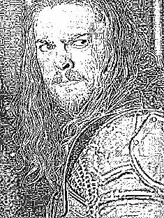
that looks like scratchboard - white lines on black. Step up the center one number at a time until you have what looks like a psychadelic coloured pencil drawing. (I have had the best luck at around 43 - you want a 
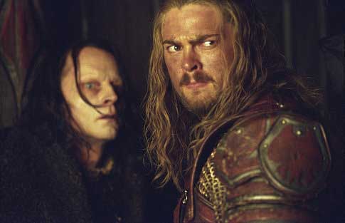
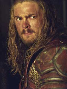
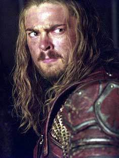
lot of lines, but not to lose too much detail. Eomer needed a 46)

If you can't get this effect, try higher numbers in the boxes - as long as the boxes are equal, and the number you start with in the center is their sum.

If you can't get this effect at all, but you can get the white on black drawing - follow these directions.... (not up yet, but this will be the link)

If you can't get anything that looks like a drawing, I have not figured out how to force a picture to behave, but I'm working on it....


sometimes these "coloured pencil" variations are quite interesting and worth playing with...


Step 7:

Go to Image in the menue bar
get Mode and choose Greyscale.

Hopefully, the image now looks like what you are aiming for.

(This is the part where I always decide I should have removed the background at the begining..)

Step 8:

Go to the filter drop-down in your layers pallette and change "Normal" to "Multiply" to darken the image.

Then make duplicates of the layer until it is jut a little darker than you want it to be. Now merge them, and turn the mode back from Greyscale to RGB

Step 9:

Eomer's background is too busy, so I am using the eraser and the polygon lasso (set with a 3pix feather) to cut it off

Then shrink the image - this tightens it up in amazing ways, Some pictures continue to improve the more you shrink them.


From here on it's a matter of playing with filters untill you feel happy with the result.

I start by choosing hue/saturation from the layers pallette - that lets me make it a little lighter of darker, and it also lets me colourize them to sepia or dark blue (or whatever....) and that's usually enough for me

this one has Hue and separation filter applied:

lightness at about +20
saturation at about -30

  this has colorize turned on in the same filter same again, but I chose blue.


The Icons